Re: 2012 C&TS Tender Lettering w/ Tri-Color Logo ... 

| Subject | Author | Posted |
|---|---|---|
| Bryan Laue | May 24, 2012 03:18PM | |
| Tomstp | May 24, 2012 07:09PM | |
| pd3463 | May 24, 2012 08:44PM | |
| Chris Walker | May 24, 2012 09:40PM | |
| Tomstp | May 25, 2012 08:37PM | |
| BrianJ | May 25, 2012 09:45PM | |
| drgwk37 | May 25, 2012 10:35PM | |
| Russo Loco | May 26, 2012 05:54PM | |
| Steve G. | May 26, 2012 04:38PM | |
| John C | May 27, 2012 08:47PM | |
| Samart | May 27, 2012 09:36PM | |
| Will Gant | May 27, 2012 10:19PM | |
| Russo Loco | May 28, 2012 02:23PM | |
| Russo Loco | May 29, 2012 02:54PM | |
| Bryan Laue | May 30, 2012 03:43PM | |
| Stewart Rhine | May 30, 2012 04:12PM | |
| drgwk37 | May 30, 2012 05:11PM | |
| Greg Scholl | May 30, 2012 05:28PM | |
| Russo Loco | May 30, 2012 05:55PM | |
| drgwk37 | May 30, 2012 06:01PM | |
| mikerowe | May 30, 2012 06:42PM | |
| Russo Loco | May 30, 2012 07:10PM | |
| drgwk37 | May 30, 2012 07:59PM | |
| Russo Loco | June 01, 2012 12:32AM | |
| Greg Scholl | June 01, 2012 09:50AM | |
| Russo Loco | June 01, 2012 01:38PM | |
| Greg Scholl | June 01, 2012 02:03PM | |
| Russo Loco | June 01, 2012 04:59PM | |
| Greg Scholl | June 01, 2012 05:27PM | |
| Lerro984 | June 07, 2012 07:02PM | |
| drgwk37 | June 01, 2012 09:03PM | |
| michael | May 27, 2012 10:20PM | |
| Steve G. | May 28, 2012 03:06AM | |
| John C | May 28, 2012 08:00PM | |
| Tomstp | May 29, 2012 02:59PM | |
| Wade Hall | May 30, 2012 09:39PM | |
| John Bush | May 31, 2012 07:00AM | |
| Wade Hall | May 31, 2012 08:28AM | |
| Greg Scholl | May 31, 2012 09:37AM | |
| RichB | May 31, 2012 10:47AM | |
| drgwk37 | May 31, 2012 11:02AM | |
| Chris Webster | May 31, 2012 04:45PM | |
| dougvv | May 31, 2012 04:59PM | |
| drgwk37 | May 31, 2012 07:06PM | |
| dougvv | June 01, 2012 03:33PM | |
| Russo Loco | June 01, 2012 01:02AM | |
| Wade Hall | June 01, 2012 09:05AM |


Sorry, only registered users may post in this forum.
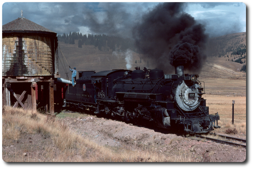
488 stops for water at Los Pinos tank on closing day Oct. 1979. Photo courtesy Don Richter
The NGDF was started by Don Richter and is currently operated in his memory by Nathan Holmes and others. Others who have contributed to the upkeep of this board are (in no particular order): Charles McCandless, Everett Lueck, Ted Wilton, Cole Adams, James Bane, John Moellmer, Jon Bentz, Linn Moedinger, lloyd lehrer, Rod Jensen, John Craft, Steven Forney, Herb Kelsey, Bill Ramaley, Russ Sperry (El Russo Loco), Josh McNeal, John West, Jim Armstrong, Bob Bergstrom, Greg Scholl, Blake Forbes Doug van Veelen and Mark Fuller.