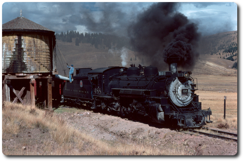
Goose #3 at Knott's
| Subject | Author | Posted |
|---|---|---|
| Jeff Taylor | June 28, 2012 03:00PM | |
| Eldon Elmore | June 28, 2012 03:04PM | |
| jalbers | June 28, 2012 03:13PM | |
| Chris Walker | June 29, 2012 02:30AM | |
| Chatzi473 | June 29, 2012 05:07PM | |
| Thunder | July 02, 2012 08:47PM | |
| Stourbridge Lion | June 28, 2012 03:14PM | |
| Larry Spencer | June 29, 2012 12:02AM | |
| Robert Herronen | June 29, 2012 07:49AM | |
| Tom Platten | June 29, 2012 09:36AM | |
| Jeff Taylor | June 29, 2012 06:07PM | |
| mransr | June 29, 2012 11:43PM | |
| Jeff Taylor | June 30, 2012 02:30AM | |
| Dirk Ramsey | June 30, 2012 05:23AM | |
| Herb Kelsey | July 02, 2012 06:47PM | |
| Jeff Taylor | July 03, 2012 12:43AM | |
| Thunder | July 03, 2012 07:42AM | |
| Jeff Taylor | July 03, 2012 11:47AM | |
| Herb Kelsey | July 03, 2012 01:09PM | |
| Thunder | July 03, 2012 06:47PM | |
| Jeff Taylor | July 04, 2012 06:08PM | |
| Thunder | July 04, 2012 09:12PM | |
| Herb Kelsey | July 04, 2012 09:46PM |
Sorry, only registered users may post in this forum.


