Tank Smith Wrote:
-------------------------------------------------------
> In the olden days of Linotype machines and molten
> leaded type, a typeface (i.e. a font) was designed
> by the ar-teest with specific glyph (letter) spacings;
> a lot of the leaded type terminology has been car-
> ried over to modern electronic typography. Some
> glyph pairs are moved closer together for
ascetics
> æsthetics, readability, etc., like pairs beginning with
> with ‘V’; this is called negative kerning. Early com-
> puter typesetting could not do kerning at all, so a
> ‘V a’ {or L V} pair always looked odd.
>
> OTOH, positive kerning increases letter spacing.
> What you aptly demonstrated is that the D & R G
> lettering artists applied positive kerning to the big
> tender numerals.
Close, Tank -
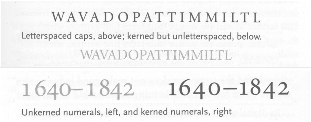
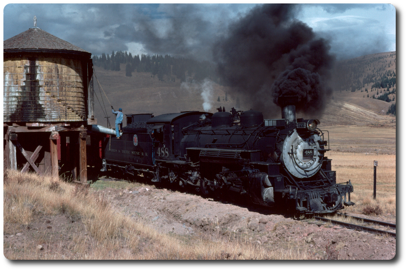
But not exactly. Ever since studying typography as part of my WebMaster Certificate studies at UCSB more than two decades ago I've used 'letterspacing' to describe "spreading out" a long string of characters (letters, numbers, etc. — aka glyphs) and used 'kerning' to describe the adjusting of space between specific pairs of characters, whether previously letterspaced or not. Thus I would describe the big tender numerals in the old D&RG photos as having been 'letterspaced' but not necessarily 'kerned'. Here are a couple of examples from the leading text in this field from the 1990s – Robert Bringhurst's
Elements of Typographic Style – which summarized several centuries of typographic tradition that undoubtedly influenced the engineers designing D&RG's "style" during the highly style-conscious Post-Edwardian era
:
§ 2.1.6
"Letterspace all strings of capitals and small caps, and all long strings of digits."

The fonts marketed by the major distributors – such as the one I'm using here to read and write to the NGDF – generally include kerning tables, so that combinations like VA, AT, LT and even OT and TO are automatically kerned when displayed. This seems to NOT be the case with the Railroad Roman font created by Benn Coifman that was apparently used by the DURANGO & SIL VERTON as a basis for the lettering currently applied to the tenders of #473, 480 and #493 and by the C&TS for the large numbers applied to the tenders of locomotives #168 and #425 (in spite of the fact that these glyphs – although close – are not precise matches of the original numerals).*
Bearing in mind Bringhurst's admonition,
"Numbers are often omitted from kerning tables, but numbers frequently kerning more than anything else. The digit one
is usually thinner in form than the other numbers, but it is often assigned the same set-width so columns of figures will align. Many fonts include an alternative version of the digit one
(the so-called 'fitted one') with a narrower set-width intended for use in text. Other combinations of digits often need more subtle adjustment, and all digits need careful kerning in relation to the en dash." Here's my best effort at duplicating #168's numbering using Coifman's original Railroad Roman font (which is neither "letterspaced" nor "kerned")
:
 . . .
. . . and a second effort using his later release of Railroad Roman For Documents (which is letterspaced but apparently has no associated kerning table)
:

Finally, just for giggles, I violated one of Bringhurst's commandments – § 2.1.9
"Don't alter the widths or shapes of letters . . . " – by squishing Benn Coifman's Railroad Roman typeface to about 80% of its normal width to fit the D&RG's specs for block lettering as posted by Jerry Day a few weeks ago (24" tall × 18" wide with 7" between numerals).

While none of the above match the old numbering exactly,* IMHO either of the first two letterspaced and kerned examples on the right above would be a BIG improvement over the non-historic numbering presently diminishing an otherwise beautiful restoration.
- El Abuelo Histœrico, Greengo y Curmudgeoño de los Locomoturas Viejos y Verdes,
aka Der Grossväterlich DünkelOlivGrünDampfKesselMantelLiebHabender
* Coifman's Railroad Roman replicates the high contrast (big difference between the thick and thin parts) of the old style, but note the nearly circular lower "bowl" of the six in the old photo of #168's tender as opposed the the oval shape of the same opening in the recent photo posted previously, and re-posted here for your convenience
:

Edited 2 time(s). Last edit at 07/05/2021 08:37PM by Russo Loco.


